The Bootstrap v4 final is available now. I began read docs and I saw that this is uncomfortable when component examples are located on different pages. Now I begin try to place these all on one page. Further follows the spaceship logbook.
I get up at six o'clock. I have lunch in seven o'clock. In the morning I clean my space ship.
I came home from space at eight o'clock and I began learn Bootstrap 4 (hereafter Bootstrap)...
+ I read Review of the 4th version of Bootstrap https://tokar.ua/read/8707.
+ Once again I read what is sass (used in Bootstrap).
+ Install Bootstarap.
+ Understand the installation options. The options Compiled CSS and JS and Bootstrap CDN are suitable. Judging by the second, only 2 Bootstrap files (css, js) and 2 js-files jQuery and Popper are needed, then why in the downloaded archive all the other files? (why - described in the documentation in the Contents section, for example, in firebug I saw an error that there is no bootstrap.css.map).
+ I found an interesting link for compiling and downloading only the necessary "Customize and download" http: //getbootstrap.com/docs/3.3/customize/
+ There are 10 sites required for the web-designer in https://tokar.ua/read/6816.
+ I read 30 lightweight JavaScript plug-ins and libraries https://habrahabr.ru/post/309430/.
+ IziModal jQuery - tooltips - impressed!
+ Propper.js - a tooltip for the site, used in Bootstrap.
+ Read the Bootstrap documentation.
+ The source code for the examples can be downloaded from the site.
+ Created a test page bs0.
+ I'm working on docks and Bootstrap examples, added to bs0. Conclusion: for landing page this is not enough.
- Make a list of other libraries used by Bent, and work through (already discussed jQuery.parallax).
- I read the docks on Bootstrap.
+ The Reboot section describes what has changed in version 4.
- I read Bootstrap Docs Components, it is difficult to understand which components are based on which ones are part of others, for which some components are required, for example, Jumbotron, here would be such a graph in the form of a tree to show which components are high and which are low. The idea is how to find out this hierarchy: look at Firebug.
- At revision of all documentation there was an idea: to make such test page that it was possible to look through all examples of contents, components, utilities on it.

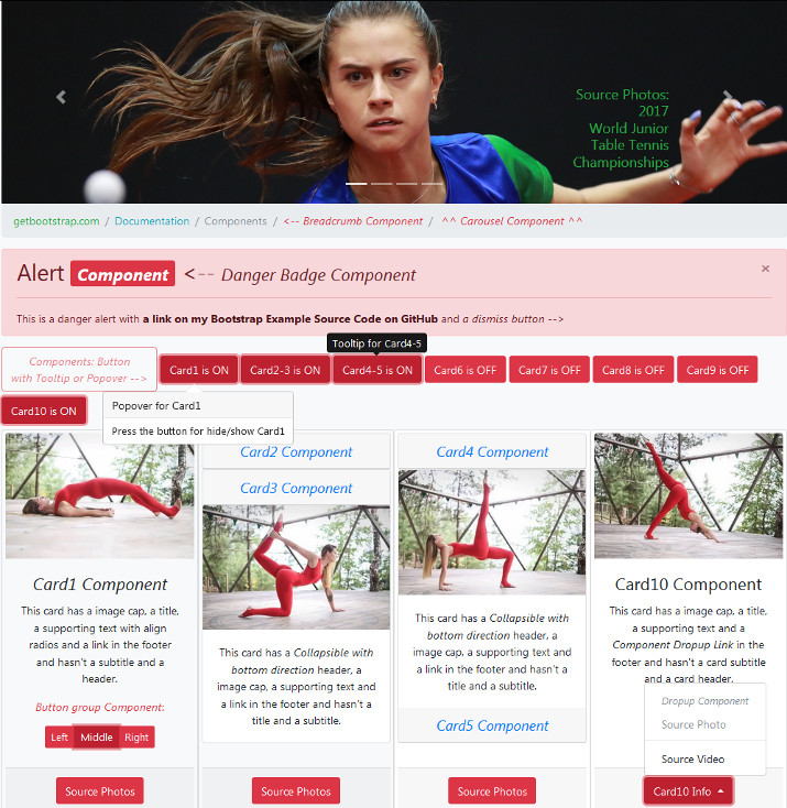
+ I can not understand how to do it correctly so that when the checkbox is clicked, the Card Component will appear / disappear. Solved.
+ It's unclear how to change the breadcrumb color. Solved.
+ It is necessary to unify the js-script so that when the checkbox is clicked, the Card Component will appear / disappear. Solved.
+ Split the checkbox buttons and change the button labels to On / Off. As a result, I replaced the checkbox with the usual buttons.
+ If you disable popper.js, then alert dismiss button does not work and cards are not closed.
+ I tried to place bs0 on blogspot or on sites.google.com/site/sergeikisite, it did not work, then I tried github.com - it turned out, and besides if I give the name to a repository like sergeiki.github.io, it even comes by the link https://sergeiki.github.io, but this way is suitable only for one project, it's a pity, therefore, something has to be sacrificed, but the idea should be remembered if you need free html hosting.
+ I got to the carousel component, the sample from the help without images did not rotate to the size of the image, as shown in the help, until I framed the images, then I realized that the help is also in the image.
+ I found good examples of carousel https://bootsnipp.com/tags/carousel, just what I'm doing.
- It can remove container, then the page will be on the whole width of the window, and it looks like it would be better.
+ You can also change the color of the entire background by adding <body class = "bg-light">.
- I do not understand how to move the carousel-caption into a corner. can be done with fixed-top + text-right, but is not it crooked?
Another observation - in the side does not move, because the sides of the elements are carousel-control.
Googling, there is a solution: .carousel-caption {top: 0; bottom: auto; }, in terms of displacement up works.
- How to use the bootstrap icons, we need the up arrow.
- Noticed 3 glitches (bugs) in the slideshow: jitter after stopping the slide, resuming the disconnected slideshow after hand switch slides and if last slide have width more than showed then it take part of first slide during slide moving.
- I tried to add a Close icon for Carousel and Breadcrumb, but it did not work, probably because for modals and alerts.
+ Another dock https://www.w3schools.com/bootstrap4/
+ On the netbook, I noticed that my decision to get the carousel-caption up with a line feed is not good. Removed line breaks.
- Is it possible to do collapsing up?
+ On the netbook noticed that the footer of Card2-4 is not at the bottom, but jumps, it turned out that there should be a card-body block, then the footer is correctly positioned according to the level of the remaining cards. Added class="class-body" in div with id="accordion".
+ Google, how to change the direction of collapse, sorted out an example, thought that the case in css or classes, then it came down - it all depends on the order of the collapsible element - above or below the control element, then it will collapse up or down, respectively.
- Idea: I can make an accordion card2-4 button as a split dropdown component and choose one of three card slots through the menu.
- The idea: to make Tooltip or Popover Component on all buttons inside which other components are not immediately visible.
+ If I click on the button, the tooltip does not disappear. Solution: data-trigger = "hover".
+ Problem: it is not possible to set and toggle popover from the enabled state (show). I decided: data-trigger="manual", $("#btn_card1").popover('toggle') and $(this).popover('toggle').
- I found an error: I do not specify data-toggle="popover" to button, but $(this).popover('toggle') works for it. Solution: I had to check $(this).attr("data-toggle")=="popover".
+ I tried Scrollspy component, bugs: when selecting an item (menu or list) the previous item is highlighted instead current item; determined that this bug is for h2-h4 HTML tags.
+ When I changed the window size then the navbar brand was unchanged; I replaced it with navbar-text.
- When I resized the browser window the scrollspy did not look nicely.
+ After updating to Bootstrap 4.0.0 above bug with radios came back; I looked at the help, there is a norm, noticed that there was a new class - btn-group-toggle, added - the norm; bug in scrollspy with h2-h4 remained.
- Bug: when opening the modal window then the justify-content-start text is moving in the navbar, and if the navbar is positioned (fixed-top etc.) then it moves to the right (because the modal window disables the browser scroll and the navbar expands, however, in the help this is not observed).
There is a Demo Link on GitHub Pages: https://sergeiki.github.io/bs0
There is a Source Code on GitHub: https://github.com/sergeiki/bs0